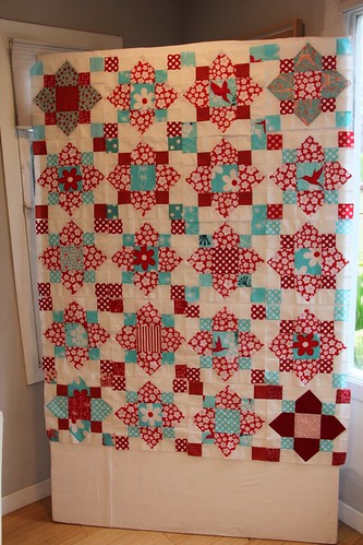
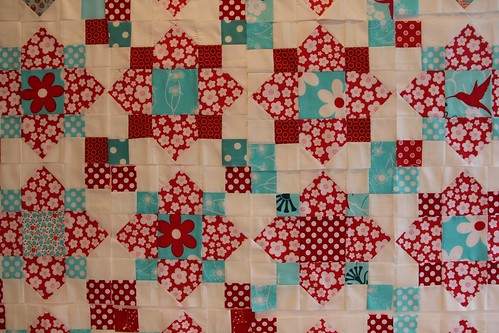
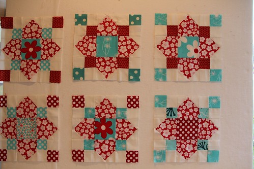
Can I just tell you how much I love my portable design wall? I made it in two pieces so it can accommodate the really wide quilts and it's so super light that I can easily move it from my (currently non-functional) studio space into the dining room in the house to play. Last night I started futzing around with the Quatrefoil Auction Quilt. I am experimenting with layouts. I will admit that I like balance and structure a little more than I wish I did and that was difficult with these blocks. I gave my fellow bee members quite a bit of freedom when making these blocks, allowing them to add their own fabrics, etc. The only instructions I gave were the block pattern and that I wanted the background white, otherwise they could play with the placements of the red and aqua fabrics as they desired. In the end many of the blocks ended up similar but there were five that ended up with large petals that weren't made out of the red floral fabric. All the rest were. I must admit that I fell in love with one of those odd ball blocks so much that I put it aside and I'm making a pillow for myself out of it. Shhh! Don't tell anyone!
I loved the odd ball blocks and decided to use the remaining four in each of the corners. Then I was going to alternate between aqua corners and red corners but I didn't have enough aqua corners for that to happen so I just started (semi) randomly throwing blocks up onto the wall. I think I like the layout that I've got up right now but at the moment I've got a debate going on in my head. Do I piece the blocks together as a centerpiece and then sash around them all in white...
...OR do I sash around each block in white so it's less "busy'?
That's today's great debate. Any thoughts?
P.S. Sorry for the crappy pictures. I was really in quite a rush when I took these.


I think I like it with the blocks touching... Sashing (for me) reads very traditional... not always my style :)
ReplyDeleteWell, firstly it's gorgeous. And also, I think there's so much white in the quilt already that it doesn't come off as chaotic busy. There's a definite pattern there and it's easy to see with all of the white background blocks. I'd say no sashing.
ReplyDeleteI really like the layout you have! The bit of random-ness of the red and aqua squares is really great. This is going to be an amazing quilt!
ReplyDeleteJennifer :)
I could see it working great with or without sashing but I'm leaning towards no sashing. You have so much white in there already and the color palate is pretty simple so I don't think it looks too busy :)
ReplyDeleteno sashing...love it!
ReplyDeleteI liked all the blocks together, then my eyes started to go a little funny, so maybe a little sashing wouldn't be a bad thing!
ReplyDeleteI think a good sashing will add stability and order to this project :)
ReplyDeleteI vote for blocks together with no sashing. I love the little squares touching in the corner. This quilt is gonna be a knockout!
ReplyDeletesew those babies together. i vote no sashing!
ReplyDeleteI vote no sashing unless you were to do sashing that had little squares where the corners of the blocks meet, so that the corners of the blocks turned into 9 patches. Does that make sense?
ReplyDeleteIt's a fun quilt.
It really caught my eye as it is .. I would be reluctant to sash. Love the colours - its really fab
ReplyDeleteNice. Aqua and Red seems to be the new Brown and Pink. Can't wait to try it!
ReplyDeleteI vote for no sashing - I think it looks great!!!
ReplyDeleteLucia, you're so clever with your nine patch idea. Hollie, it's going to beautiful which ever way you go. What a wonderful dilemma! Can't wait to see it finished.
ReplyDeleteIt's so interesting that the almost all the blocks ended up with similar fabric choices. I like them in one big block with outside sashing myself.
ReplyDelete